Creating a Prefab system

What is a Prefab?
A prefab is a reusable Game Object that can contain virtually anything related to a game. You might also hear them referred to as templates or instances. Prefabs are crucial for effective game development. For example, a prefab could be a character, a weapon, or an environmental element like a tree or building. They allow developers to create complex game elements once and reuse them throughout the game.
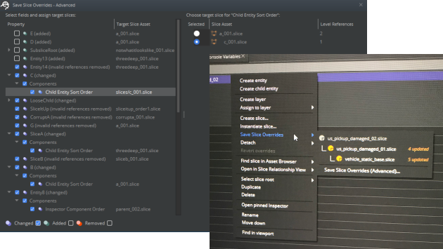
In our case, we inherited a system from Cry Engine that used ‘slices’ – their version of prefabs. As we prepared O3DE to support AAA game development and large open worlds, we discovered that the existing system, while highly editable, had some significant limitations. This led to the Keystone project.
Our team took on the challenge of overhauling O3DE’s 3D game template system, as we started preparing the engine for large open world development for some of our internal games.
We noticed that slices were over emphasizing a need for maximum editability. However, this approach didn’t take into account object interaction, encapsulation of prefabs, or ease of use at all.
The results: some really angry game teams. We saw that users were losing significant amounts of data and weeks of work due to accidental overrides and incorrect slice saves.
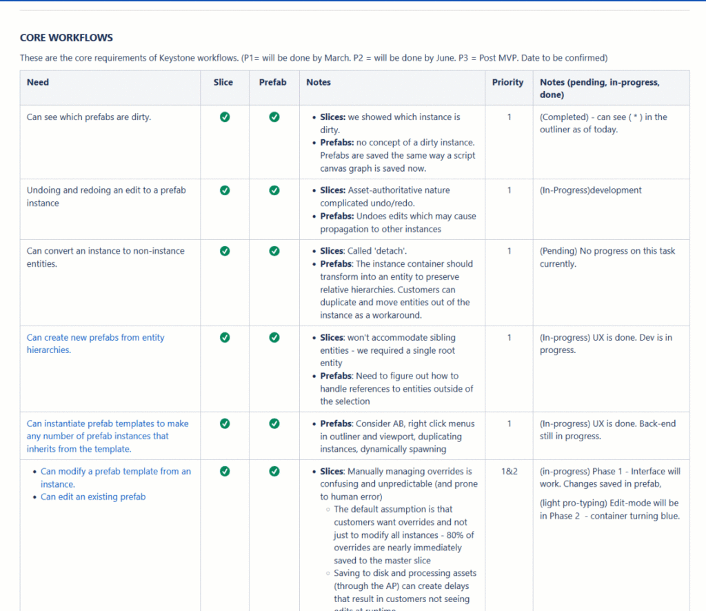
We ended up consolidating and collecting around four years worth of customer feedback that highlighted critical issues:
- Versioning was difficult and often failed spectacularly.
- Managing overrides was complex and confusing.
- Slice operations were slow and unstable.
- Slice code and asset markup were hard to understand.
- Customers requested better nesting and override capabilities.
- We want to transition from XML to JSON system with our new Atom renderer.
To address these challenges, we set several key goals for our team:
- Simplify the architecture, making the code easier to modify and debug.
- Streamline the data, ensuring files were small and easy to read.
- Improve versioning of patch data to make changes safe and flexible.
- Optimize operations, particularly saving and propagating changes.
- Stabilize workflows, ensuring overrides and undo were safe operations.
- But above all else, simplify the user interface, making it easier for users to build and understand large hierarchies without thinking too deeply about the save operation itself.
This project wasn’t just about fixing a system – it was about reimagining how developers interact with game objects in a large-scale, AAA development environment.
My role:
In this project, I had to wear multiple hats, serving as both a product owner and a lead designer. My responsibilities were diverse and crucial to the success of the Keystone project.
As a product owner, I collaborated closely with the business and development team to refine goals and ensure the new prefab system was accurate and what the customer was asking for. I was responsible for tracking backlog items and prioritizing features based on user needs and business objectives. I was not the only person working on this but as it was large effort and the use case were substantial so it was all hands on deck.
But as lead designer, I created comprehensive UX specifications and workflow diagrams. These documents were essential in guiding the development team and ensuring all use cases were addressed. I was fully responsible for executing, designing, iterating on, and conducting usability testing on all the workflows.
A significant part of my role involved cross-team collaboration. I worked closely with developers, leads, and PM’s regularly iterating on designs based on technical constraints and opportunities. I also conducted, analyzed, and integrated the user research feedback into our designs. This iterative process helped to continually improve the system as we learned more.
Communication was key in this project. I prepared and delivered show-and-tells to demonstrate progress and gather feedback. I also gave presentations to leadership about our direction and progress, ensuring alignment across all levels of the organization.
Our target users encompassed both existing and new users of the game engine. This included a range of developers, from individual creators to large AAA game studios. We were particularly focused on supporting several high-profile AAA games already in development.
Our business goals were threefold:
- Significantly improve the user experience for game developers working with our engine. By addressing known issues and introducing a more robust prefab system, we wanted to streamline the workflow and prevent the frustrating data loss issues they had been experiencing.
- Retain our existing user base. These developers had invested time and resources into learning and using our engine, and we needed to ensure that our improvements would enhance their experience without disrupting their ongoing projects.
- Attract new users to the engine. By offering a state-of-the-art prefab system, we hoped to position O3DE as a leading choice for game development, particularly for large-scale and open-world AAA games.
By focusing on these users and goals, we ensured that the Keystone project would deliver value not just to our immediate users, but to the broader game development community and to AWS position in the game engine market.
So how did we do this?
I started this process by dog-fooding the previous system. If your not familiar with the term, its a form of using the product as the ideal user and running through user responsibilities to see the issues first hand. As I have a good understanding of the game development process. I start by noting down what problems I was encountering, what things I’m liking, and what seems to be broken and what questions I need go out there and search for.
From here I took my feedback and combined it with our users feedback from usability testing, feedback from product, the development team, and consolidate this into a global list. This gets me to a list of all the problems that we know of.
I then look for overlapping for problems between all the different groups. Finding all the unique feedback and all the blocker issues. This means which problems are coming up more often and which issues are causing people to stop in their tracks. I also integrated any business requirements or tech specs docs. This helped create a list of core workflows.
I then took these core list of problems and do my first pass at stack ranking the issues based on either specified priority or the severity of the issues that has experienced by users. We generally leave the name of the owner of task next to each item.
So now that we have a list of problems, we will validate our understanding and prioritize these problems.
After having a clear sense of the problems and full list of of the issues. We will start to integrate some of suggested solutions next to each problem. Some will be left blank for whiteboarding sessions later on.
For us, we designated key stakeholders and decision makers to help validate the problems and suggest solutions.
We also like to designate key stakeholders to prevent too many cooks in the kitchen and simplify the decision making process.
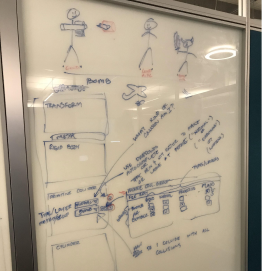
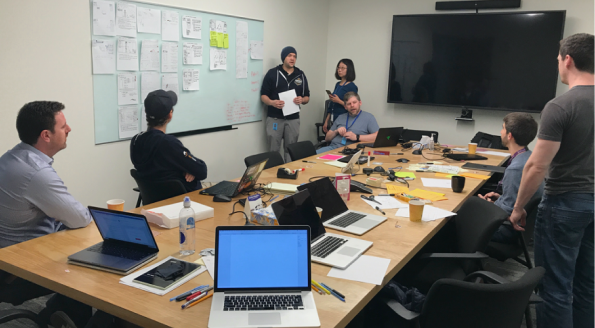
Next, this is where design iteration begins, including ideation and discovery. Most often this will end up in some kind of virtual or physical whiteboarding sessions with stakeholders going through the issues one at a time.
This process can be done independently depending on how involved the team and who would like to be involved with specific problems.
This can look like someone describes to the group their idea about how a problem can be fixed. I’m often reflectively visualizing what I am hearing or what I just heard about their solution. “So what I’m hearing you say is. You would like to see and hear…” After drawing out a solution I will note any gaps in the workflow for follow up.
After we have iterated on solutions. I will note out any questions we have for users or stakeholders for later. This also may include any points of disagreements we might have about a solutions (this could result in some version of A/B testing). As well as any concerns or constraints we might be dealing with.
Now depending on the size of the problem we could head into one of two ways.
Way 1 – additional research with customers to get more information about the problem. Dig a little deeper into specific subject so we fully understand the problem.
Way 2 – we move into an early draft of conceptual design. Listing out the page in a sitemap, key areas where we as a team conceptually can understand the fixes.
In either case we start getting the stakeholders back together to review the findings and help make decisions and move forward.
This sometimes can lead into good conversations about system limitations, about things that can work and things that still need more refinement.
The idea is to separate the workflows into two segments. What we have agreement on and what still needs more work. But at this stage, the team is working towards refinement.
So lets talk about my research methods and process.
Generally depending on the task I try to use both methodologies (Quantitative and Qualitative) data. I’ve been spoiled in the last few years as I’ve finally have a researcher on my team. But before this, these kinds of activities were always on me to host and figure out.
So this means I’ve conducted research activities like: User interviews, surveys, usability tests, A/B tests, diary studies, etc.
Some of the outputs for research can result in different design artifacts being created such as: Personas, Experience mapping, Customer Journey Mapping, Business persona, User center design documents, and of course prototypes.
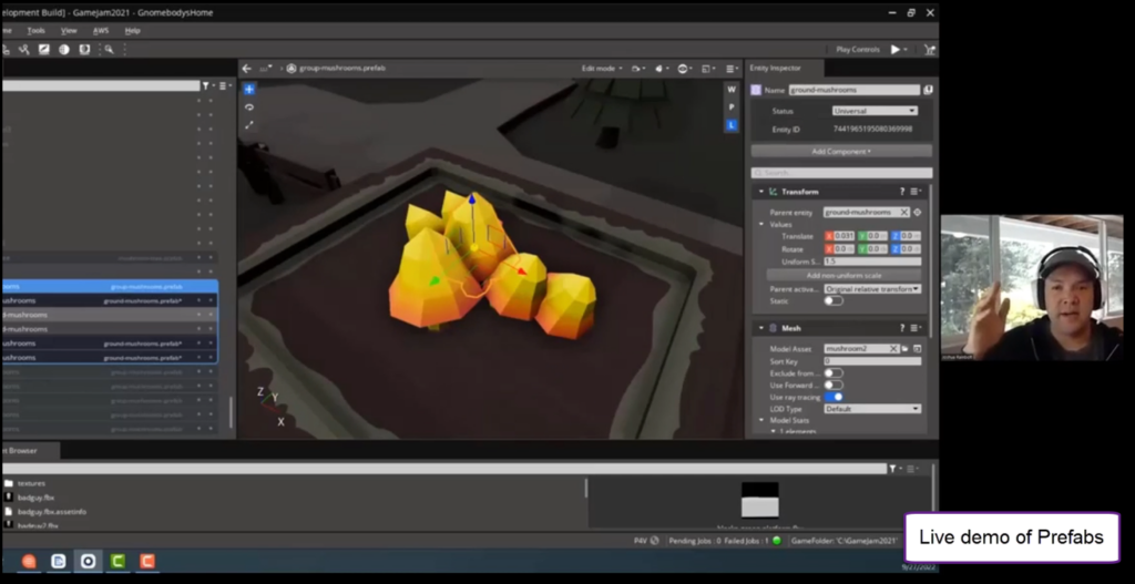
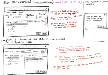
This video shows an example of how I’ve collected data in unique ways. This example was done specifically for this project. Instead of building in real code and then testing it out and then making changes which cost a lot. I created this interactive prototype to get users real life feedback before creating a fully built feature. This was a functional prototype I built in Axure with a ton of JavaScript and sent it out to users and asked them to follow along.
Some things you might notice during the video is that I used the output panel to track time on task, when a customer bailed on a task, which specific method did a customer use (right click vs menu), and a few other user interactions. When the user is done taking the test, the results were written into an email and sent back to me. At this point, I consolidate all the feedback and verify if our decisions that we made in the design were correct or not. If not, we make adjustments. We also look at some overall attributes like time and overall satisfaction score.


So in the end this project was considered very successful in creating a prefab system that the community loved. It was powerful, friction free, covered all of the unique use cases the customers were asking for. One of the most important beautiful portion of the UX was that the interface was based on a user location hierarchy design method for saving. Meaning where you make the edits is the location in which the user changes will be saved to. This UX was very tricky to get right and highly iterated on process. The feedback from users told us that it felt very intuitive and prevented them from any further data loss. We also create a temporary prefab save state environment where all the changes could be stage to the user before committing content to a save. This allowed us to revert changes quickly and gave customers quick interaction in the UI.
We did track a CSAT score of our customers on a likert scale. This is a measurement and a score of a customers overall satisfactions with using this feature or service. Its rated from 1-5 and in our case was with 20 unique and high profile users. It tested at the beginning and then again after the process was completed.